Traffic prediction based on public transport transit times (III): Data analysis and prediction
by
This is the third part of the series on the project about traffic prediction. You can see it online here: http://fergonco.org/border-rampage/.
In the previous post I introduced the process gathering data from Geneva public transport (TPG) API.
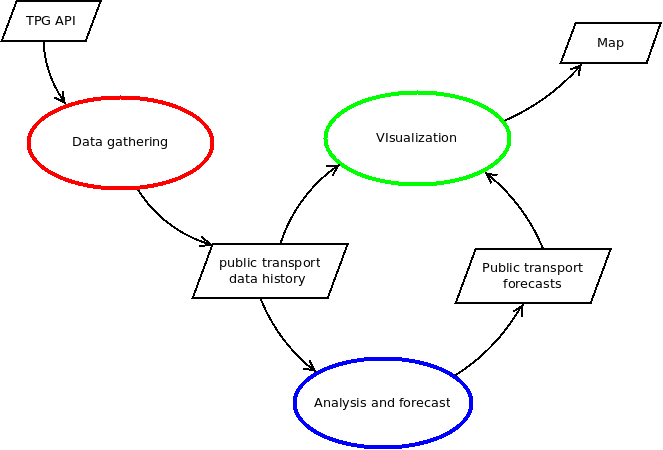
In this one I will show the process of analyzing the data and generating predictions, in blue in the following diagram.
Public transport network
Before analyzing the data I’ll explain how the database is organized: how the public transport network data is stored in the database and how the gathered real time data references this network.
All the network data is taken from OpenStreetMap. The Overpass API allows to download an XML file containing the nodes and paths that form the road network in a specific area:
wget 'http://overpass-api.de/api/map?bbox=5.9627,46.2145,6.1287,46.2782' -O network.osm.xml
OpenStreetMap not only has the information about the roads but it also has the routes that the TPG services follow. I set up a program that takes this information and some metadata about the public transport lines and produces the following three tables:
-
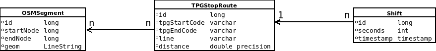
The first one, OSMSegment, contains all the segments that form the TPG service routes:
 id | startnode  |  endnode   |                         geom
----+------------+------------+-------------------------------------------------------
  1 | 3735051668 |  429658525 | LINESTRING(6.1413701 46.2103922,6.1415854 46.2105857)
  2 |  768498823 | 3606163490 | LINESTRING(6.1408597 46.2098549,6.1409013 46.2099104)
  3 | 3606163601 | 1549433399 | LINESTRING(6.1410869 46.210142,6.141181 46.2102227)
  4 | 3790832523 | 3735051668 | LINESTRING(6.1413209 46.210348,6.1413701 46.2103922)
  5 | 3606163490 |  768498820 | LINESTRING(6.1409013 46.2099104,6.1409186 46.209933)
  6 |  932144719 |   35422066 | LINESTRING(6.1412324 46.2128284,6.1412561 46.2129397)
  7 |  308047791 |   35422067 | LINESTRING(6.1412629 46.2129944,6.1413116 46.2135465)
  8 | 1191965235 |  895572292 | LINESTRING(6.1417423 46.2107912,6.1417375 46.2108256)
  9 |   35422062 | 1191965235 | LINESTRING(6.1417364 46.2107529,6.1417423 46.2107912)
 10 | 3790832520 | 3790832523 | LINESTRING(6.1412051 46.210244,6.1413209 46.210348)

-
The second one, TPGStopRoute, contains an entry for each pair of consecutive stops in a service line, along with the distance between them. Note that the start and end stop codes are not unique because there may be two lines with the same consecutive stops but with a different route between them. Hence the line field.
id | line | starttpgcode | endtpgcode | distance -----+------+--------------+------------+------------------- 72 | Y | POLT | PAGN | 0.747157007209657 103 | F | LMLD | ZIMG | 0.685551031729394 104 | F | ZIMG | LMLD | 0.685551031729394 105 | Y | ZIMG | PRGM | 1.36371355797978 106 | Y | PRGM | ZIMG | 1.3855137325742 107 | O | PRGM | SIGN | 0.933634195084444 108 | O | SIGN | PRGM | 0.939506323487253 110 | Y | RENF | SIGN | 1.24229383530575 112 | Y | BLDO | RENF | 0.383096769721964 125 | Y | AREN | PXPH | 0.75218625106547 -
The last table supports a many-to-many relationship between these two tables: for each pair of stops in a service line it associates a list of OSM segments.
You can see the many-to-many relationship in the following diagram:
Gathered data and the unit of analysis
The data gathering process detects vehicles moving from one stop to another and fills a table called Shift with the data about the move and a foreign key to the route the vehicle followed, in the TPGStopRoute table. The Shift table looks like this:
   id   | seconds |  sourceshiftid  |   timestamp   | vehicleid | route_id
--------+---------+-----------------+---------------+-----------+----------
 188508 |      77 | 1-4-2017+185220 | 1493643974000 | 185220    |      103
 188509 |     144 | 1-4-2017+185221 | 1493644119000 | 185221    |      105
 188510 |     112 | 1-4-2017+185222 | 1493644231000 | 185222    |      107
 188470 |     138 | 1-4-2017+185082 | 1493642592000 | 185082    |      112
 188471 |     144 | 1-4-2017+185083 | 1493642735000 | 185083    |      110
 188472 |      75 | 1-4-2017+185084 | 1493642811000 | 185084    |      108
 188473 |     119 | 1-4-2017+185085 | 1493642931000 | 185085    |      106
 188477 |      93 | 1-4-2017+185319 | 1493643128000 | 185319    |      125
 188474 |      80 | 1-4-2017+185086 | 1493643011000 | 185086    |      104
 188466 |      39 | 1-4-2017+185015 | 1493642567000 | 185015    |       72
Each entry represents a vehicle arriving to a stop and it contains: the timestamp when it happened, the number of seconds elapsed since the previous stop and the route_id, which points to the TPGStopRoute and provides information about the exact route the vehicle followed.
Thus, the gathered information associates the same speed to all segments between two stops. Actually, the vehicle has a different speed on each segment (and even along the segment), but with the TPG API it is as far as one can go because it does not provide information between stops.
I could have used this, the route between two stops, as the unit of the analysis. But I didn’t because I have plans to add some private vehicle GPS tracks that could refine the data collected through the TPG API.
Therefore, the unit of the analysis is the OSM segment. There will be many segments where the data gathered is exactly the same but I ignored this fact, expecting one day to refine the data the system gathers.
Data preparation
The process to prepare the data involves:
- Filtering out some obvious data errors.
- Removing duplicates introduced in some early version of the data gathering process.
- Calculating speed for each shift between stops.
- Generating variables: holiday in France, holiday in Switzerland, day of week, etc.
I use R for the statistics calculations and probably I could have managed to do the previous process with it. But I am not so proficient with its data structures and functions so I implemented it in Java. This is a tedious process and I think it is good to use a language you know well.
At the end of this process I got a CSV file that R could easily consume. This file has a row for each time a vehicle drove through the segment, and for each row it has the following variables:
- speed: speed between the two stops that contain this segment.
- timestamp: when was the speed measured.
- minutesDay: minutes since midnight.
- weekday: day of the week.
- holidayfr: binary, indicating if it is holiday in France.
- holidaych: binary, indicating if it is holiday in the Geneva canton.
- schoolfr: binary, indicating if children have school in France.
- schoolch: binary, indicating if children have school in the Geneva canton.
- humidity: the last registered humidity.
- pressure: the last registered pressure
- temperature: the last registered temperature.
- weather: A code indicating the type of weather (cloudy, sunny, rain, etc.) last registered.
I didn’t mentioned before, but the gathering process also gathers data from the OpenWeatherMap API each few hours.
A look at the data
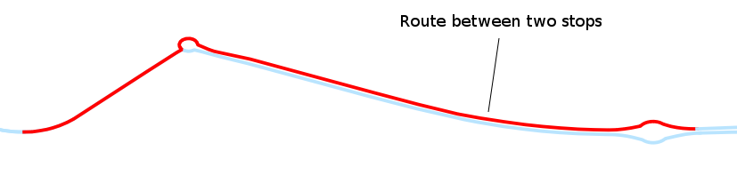
In order to take a look at the data I chose a segment whose pattern I know well: the one I always take to go to Geneva. And this was one at the CERN border, direction to Geneva:

Based on my experience, the pattern should be clear: on busy days it collapses early in the morning and the rest of the day is more or less free. Producing some charts more or less confirms this pattern.
First, the speed histogram shows two modes and a skew to higher speeds.

I already expected the lower mode, due to the traffic jams in the morning, but the skew to high speeds was a bit surprising. A look to the histogram per day sheds some light:

To no one surprise, the speeds Saturdays and Sundays are, in general, higher and this is producing the skew.
Another variable that could have some relation was the weather. I grouped cloudy and sunny weather together because I don’t think it has an effect and left all the other weather conditions. I started to gather data at the end of the winter, so there is few data about adverse weather conditions. With a bit of imagination one could see bigger lower mode by rain or slower speeds by mist, fog and drizzle. But definitely there is not enough data.

And of course, the time of the day is relevant. The next plot shows how the speeds drop between 7am and 10am. The time is expressed in minutes since midnight.

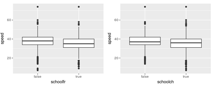
Surprisingly, the binary variable indicating if it is a school day in France or in the Geneva canton didn’t correlate as strongly as my experience says (a lot!). This may be due to the fact that it has an impact on a small part of the measurements of the day. Or to the fact that the beginning of the summer contains a lot of observations with schoolfr to false but traffic jams where common. Probably a cleverer variable can be generated.
Model
As a newbie statistician, the selection of a model is one of the hardest parts. This is an ongoing process that I will improve as I learn new methods.
The first model I fitted was a linear regression. As we saw, the relation between speed and time of the day is not linear, so a linear regression would look like this:

and would predict higher speeds on the rush hour between 7am and 10am and lower speeds immediately afterwards. The residual vs fitted plot shows it: when low speeds are predicted the residual (|y - ŷ|) is clearly negative (the prediction is bigger than the real value) and just afterwards the residual becomes positive (the prediction is smaller):

There are many methods beyond linear regression. Given that the data follows a similar pattern everyday, I would like to give K Nearest Neighbours Regression a try (basically get the mean of the K most similar points). And given that my data has a temporal structure, probably I should use some approach for seasonal time series. But so far I have just fitted a polynomial regression.
In order to select the model I had to select the variables that were interesting, as well as the degree of the polynomial for minutesDay. Based on the plots shown before I considered these formulas:
- speed ~ poly(minutesDay, i)
- speed ~ weekday + schoolfr + poly(minutesDay, i)
- speed ~ weekday + holidaySizefr + poly(minutesDay, i)
- speed ~ weekday + poly(minutesDay, i)
- speed ~ schoolfr * minutesDay + schoolfr + poly(minutesDay, i)
- speed ~ weekday * minutesDay + schoolfr * minutesDay + weekday + schoolfr + poly(minutesDay, i)
where a ~ b + c + bc means “a as a function of b, c and the interactions between them” and *i is the degree of the polynomial from 1 to around 20.
I performed a cross validation on the different models splitting the data in months, as explained in this stackexchange post and I obtained the following estimates for test Mean Squared Error (MSE, an indicator of how good would the model perform on new data):
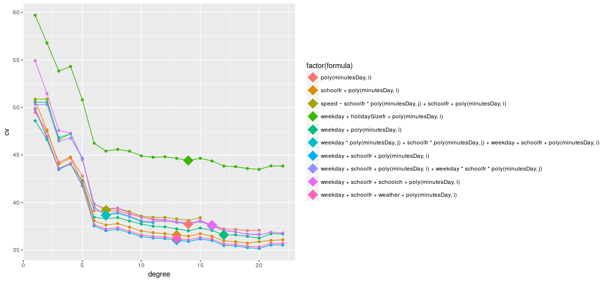
All formulas produce a better estimate as the polynomial degree increases but slowly the increase gets smaller and becomes eventually zero. Theoretically it should start increasing at some point, where the high degree polynomial starts to fit too well the training data and perform poorly on the new data. Maybe testing with more degrees would show the U-shape but there is not enough data to do it.
The point on each line shows the model selected by the one-standard-error rule: the simplest model for which the estimated test MSE is within one standard error of the lowest point in the curve. Thus, the model with the best cross validation MSE estimate is the one involving weekday, schoolfr and minutesDay with a 13 degree polynomial.
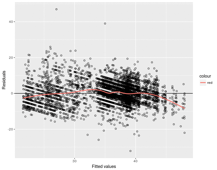
An analysis of the residuals shows that this time they are more centered around zero, although they still do not follow a normal distribution.
 |
|
Generating predictions
In order to produce forecasts for a segment, it is necessary to generate the model for its data and then use it to obtain forecasts. These two steps are run for all the OSM segments as follows.
To generate a model for each OSMSegment:
For each OSM segment
   Prepare the data for the segment (as seen above)
   Make R build a model
   Store the model in the *OSMSegment* table (there is a bytea field for this)
Then, to generate the forecasts:
For each OSM segment
   Get its model from the database
   Build a dataset with the variables values: day of the week, weather, etc.
   Ask R to provide a forecast with the retrieved model and the generated dataset
   Store the forecast in the database
Sounds simple but it wasn’t. There were several things that made implementing these two steps complicated. The two main difficulties were:
-
Model size. R lm function, the function which generates a linear model, produces objects whose size is around 500kb. Multiply this by 4000 OSM segments and you get 2 Gigabytes.
But actually, in order to apply the model and produce a forecast, it is just necessary to multiply the variable coefficients by the variable values. I just need some numbers! So there had to be a way to keep the models well under 500Kb.
And, indeed, there is a way, with the only problem that it involves the glm function (instead of lm) and I had to adapt the R script. Finally I ended up with 15Kb models, which was much better.
-
R script. Both processes are executed from Java as new system processes. Initially I called the R script for each OSM segment. Launching 4000 processes is a bit slow so I changed the R script to deal with all the segments in one execution. This time, although it is still a lot of computation, the performance was enough to let the server calculate forecasts each half an hour or so. Maybe using some R Java API like rJava could improve performance even more.
Next steps
As explained on the point about the model, it is a work in progress so the obvious next step is to improve the model.
I would like to give a quick try to K Nearest Neighbours regression. In my experience, days follow very clear patterns and it seems to me that even picking the speed of the most similar observation (K=1) could yield good results.
I could also explore the temporal structure my data has. It comes to my mind that I could add the speed of the same day and same hour from last week as a predictor variable (autoregression) and there are time series based techniques that could be applied.
I would also like to evaluate the predictions. Currently, I do this by opening the map and changing from the latest measure to the first forecast to see that the map does not change much. It does not look bad but of course this is not a very strict evaluation method. I would like to analyze the deviations between forecast speeds and actually measured ones.
And finally, and quite far in the future, I would like to include GPS tracks to have a finer map. Maybe find relations between public transport and private GPS tracks and extend the map to areas not covered by public transport.
Lessons learned
Just one, but important: Data gathering is key for the success of the project and it is very easily to get noise, errors, etc. in your data. It is important to check the data gathering process early: do some cleaning on the data and some exploratory analysis that would show if there are weird data.
tags: